- Economic data can be misleading
- It can also be subject to political spin
- This is particularly true in election years
“There are three kinds of lies: lies, damn lies, and statistics.” – Mark Twain, attributed to Prime Minister Benjamin Disraeli.
Although I made my name in the City of London working as an investment strategist rather than an economist, I have an academic background in economic history. This includes that of the United States, where I obtained both my undergraduate and graduate degrees.
When I started my career on Wall Street in 1993, while my knowledge of economic history was certainly useful, when it came to the day-to-day of preparing reports for clients, knowledge of the minutiae of modern economic data and forecasting played a much greater role.
Fortunately, I had good mentors, including a few who were highly critical of the way in which much economic data was reported and interpreted. They didn’t necessarily believe that the data was wrong – although they were open to that possibility – but they felt that, due to a variety of factors, there was sometimes as much or more “spin” around data, as substance.
One of these factors is pure politics. This being a US election year, it is understandable that the current, official spin around data is bullish. Nearly every US presidential election is a referendum of sorts on the performance of the economy.
US political historians and pollsters are well aware that relatively simple economic models have predicted past presidential election results with startling accuracy. There are exceptions, such as Kennedy vs Nixon in 1960 and Biden vs Trump in 2020. But the vast majority of elections over the past century follow the economic models.
Hence last week’s apparently strong US labour market report has been in both the economic and political headlines. The Biden administration is claiming this is proof of just how well “Bidenomics” is working. And many independent commentators, including a former colleague of mine and the chief US economist for Lehman Brothers, agree.
So, putting on my critical economic data hat, let’s have a look at this report and what it tells us, or perhaps doesn’t, about the state of the economy as we enter deeper into primary election season.
The headline figure in the report is that job payrolls increased by 353k during January. That’s a big number, roughly double what forecasters had expected. The unemployment rate held at a low 3.7%. Average hourly earnings also rose, from a 4.1% growth rate to 4.5%.
So, the key takeaway here is that jobs growth is strong. So strong in fact that there are now only few unemployed and workers are demanding and receiving higher wages. This would seem to vindicate “Bidenomics” and to bode well for the US president’s re-election chances come this November.
Yet Biden’s approval ratings are low. Very low. Dangerously low according to the history of approval ratings and re-election success. So, what gives? Is there something that this report isn’t telling us, at least in the headline figures?
There is indeed. Let’s look behind the headlines, shall we?
First, the average weekly hours worked declined. In light of all of the above, that seems rather odd, doesn’t it? If the labour market is so hot, why are workers working less? You’d think they’d be working overtime instead, perhaps justifying that rise in average hourly earnings.
Second, the report divides employment status up into full-time and part-time. And guess what? Over the past year, including the January report, there has actually been a small decline in full-time jobs. All the growth has been in part-time jobs instead.
Third, the composition of jobs has been changing. As former US Federal Budget Director David Stockman explained when describing the December jobs data:
Fully 183,000 or 85% of the 216,000 new jobs reported for December 2023 were in the low-pay, low-productivity sectors of government, leisure & hospitality, retail trade and health and education services. Indeed, owing to the short weekly hours in many of these sectors, the index of aggregate hours worked actually declined during December from the November level.
That’s right. The actual deployment of labor hours in the nonfarm economy shrank during December, notwithstanding the ballyhooed 216,000 gain in the nonfarm headcount.
Borrowing his approach, in January, the low-productivity sectors he lists above comprised over 300k of the total 353k payrolls increase. And as per above, aggregate hours worked declined yet again.
Pulling it all together, “Bidenomics” might be creating jobs. But it is losing high-productivity full-time jobs and gaining primarily relatively low-productivity part-time jobs, public sector jobs and leisure and hospitality jobs.
Does that sound like a strong economy to you?
It doesn’t to me, and it helps to explain why Biden’s economic approval ratings are so low notwithstanding his administration’s celebration of the headline labour market data.
Now, it is also worth considering why the US economy is creating any jobs at all. Yes, the economy is growing, which implies jobs growth. But what is the source of this growth?
The following chart shows how, since the early 2000s, the US government has been running chronic budget deficits. This means that the government is spending more than it is taking in during periods of both weak growth and strong growth.
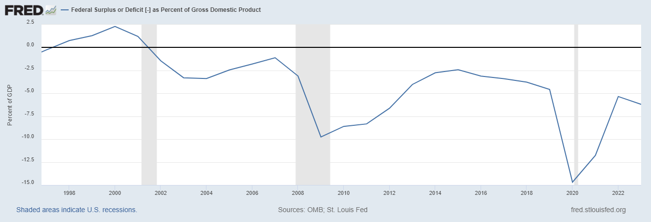 Source: fred.stlouisfed.org
Sure, if the government is willing to spend and borrow, even when the economy isn’t in recession, then of course you can create jobs. If I went out and borrowed huge sums of money and spent it on leisure, hospitality and travel I’d create jobs too.
But are these high-quality jobs that can support entire households, or rather low-productivity and/or part-time jobs? As seen above, when looking behind the economic headlines, Bidenomics is doing fine creating the latter but failing to create the former.
Crossing the pond, the picture in the UK is rather similar. The government has been running chronic budget deficits for many years. Unemployment is low but the composition of jobs has been changing in much the same way as in the US, from rather higher- to rather lower-productivity ones.
That said, the overall performance of the UK economy has been somewhat worse than the US as of late. Could that be because the tax and regulatory burden is higher? Because the public sector is larger? Because the UK no longer produces much energy domestically, whereas the US is an energy powerhouse?
Those are all plausible explanations. They also might help to explain why the upcoming US presidential election is expected to be a fairly close race, whereas the UK Conservatives look set to lose their parliamentary majority for the first time in some 15 years.
The prospects and possible consequences of a Labour victory are the topic of the January edition of The Fleet Street Letter, sent out to subscribers last week. It presents eight ways in which investors can prepare to protect their wealth from new forms of taxation, new regulations and further growth of the public sector at the expense of the private. If you’d like to learn more about The Fleet Street Letter’s strong track record of forecasting political developments and providing investors with practical advice, you can do so here.
Until next time,

John Butler
Investment Director, Fortune & Freedom