It’s the most important investment chart of the next ten years. And our friends at Incrementum AG, who publish the legendary In Gold We Trust report, have given us permission to publish it here.
It shows the value of any commodity relative to financial markets. Specifically, it illustrates the Goldman Sachs Commodities Index divided by the value of the S&P 500 stock market index. When the ratio is high, commodities are expensive relative to stocks. When it is low, commodities are cheap.
You won’t win any prizes for figuring out which is the case right now. But you may discover an investment opportunity…

Source: Incrementum AG
Over time, the ratio is mean reverting, meaning that it oscillates between high and low levels. And each oscillation is what creates the investment opportunity.
The chart implies a huge boom in commodity prices, a crash in stocks, or some combination of the two. Either way, commodities are the better place to be for the next decade or so.
You can subscribe to and download the brilliant In Gold We Trust report in full for free here.
But the big question on everyone’s lips is whether the mean reversion has officially begun given the recent news on commodity prices. Even oblivious people on the street can’t ignore it any longer.
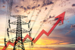
Markets for commodities, and energy in particular, are in absolute turmoil. In very short order, this has had an impact on household budgets.
If you’ve spent the last few weeks wondering what on earth has happened in commodity and energy markets to cause all this chaos, today’s video is for you.
I invited in the most knowledgeable and experienced commodity investor I know to explain what’s going on, and what happens next.
Good luck enjoying what he has to say though…
To find out more about Simon Popple, check out www.brookvillecapital.com
![]()
Nick Hubble
Editor, Fortune & Freedom